'Learning is boring our staff! We need a new approach'
My approach involved crafting an engaging solution to actively engage users at both individual and departmental levels. This meant introducing a new platform that struck a balance between professionalism and user-friendly features, infused with a touch of gamification. By introducing optional elements of friendly competition, users were incentivised to aim for higher scores, thereby enriching their learning journey.

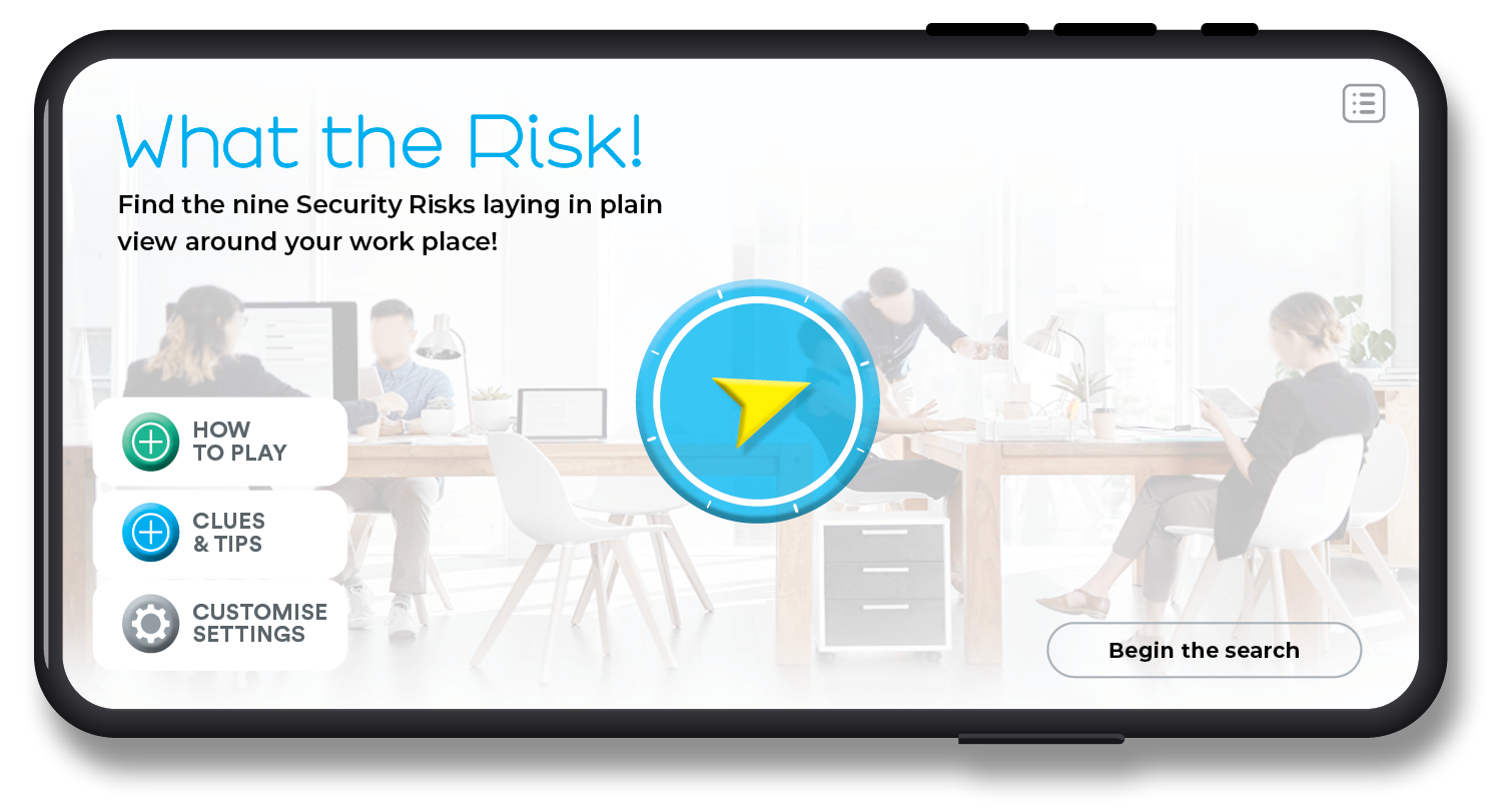
Prototype screen demo
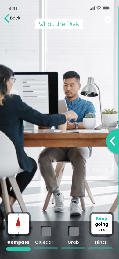
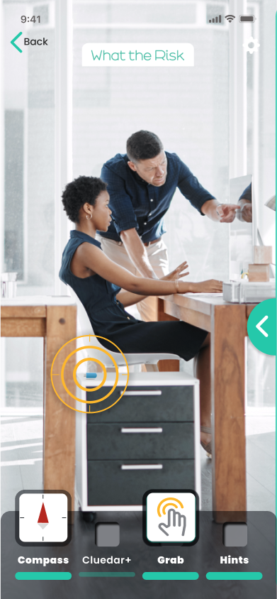
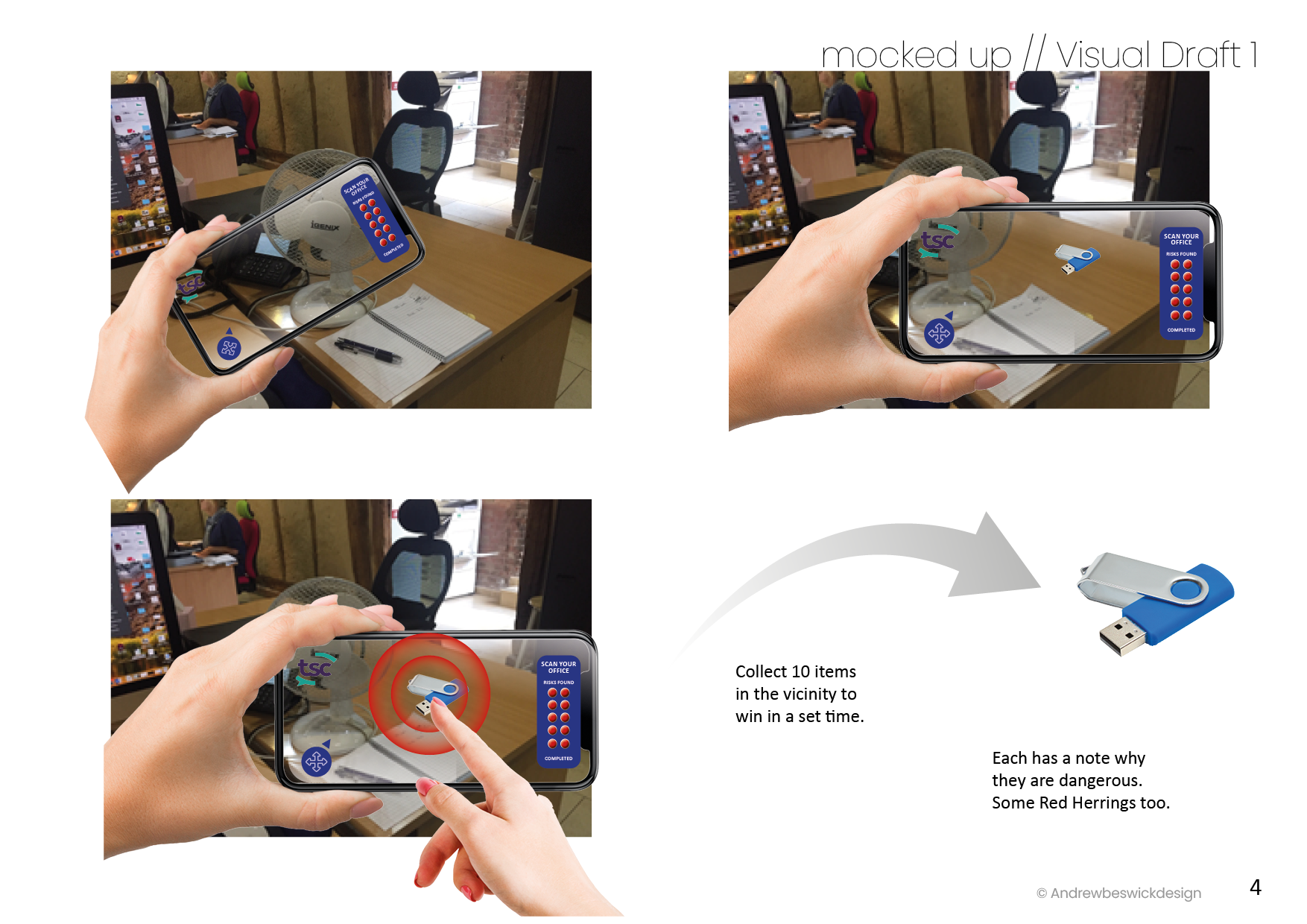
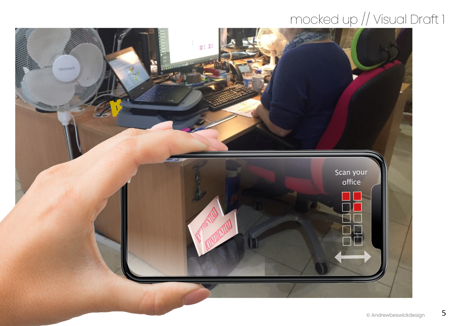
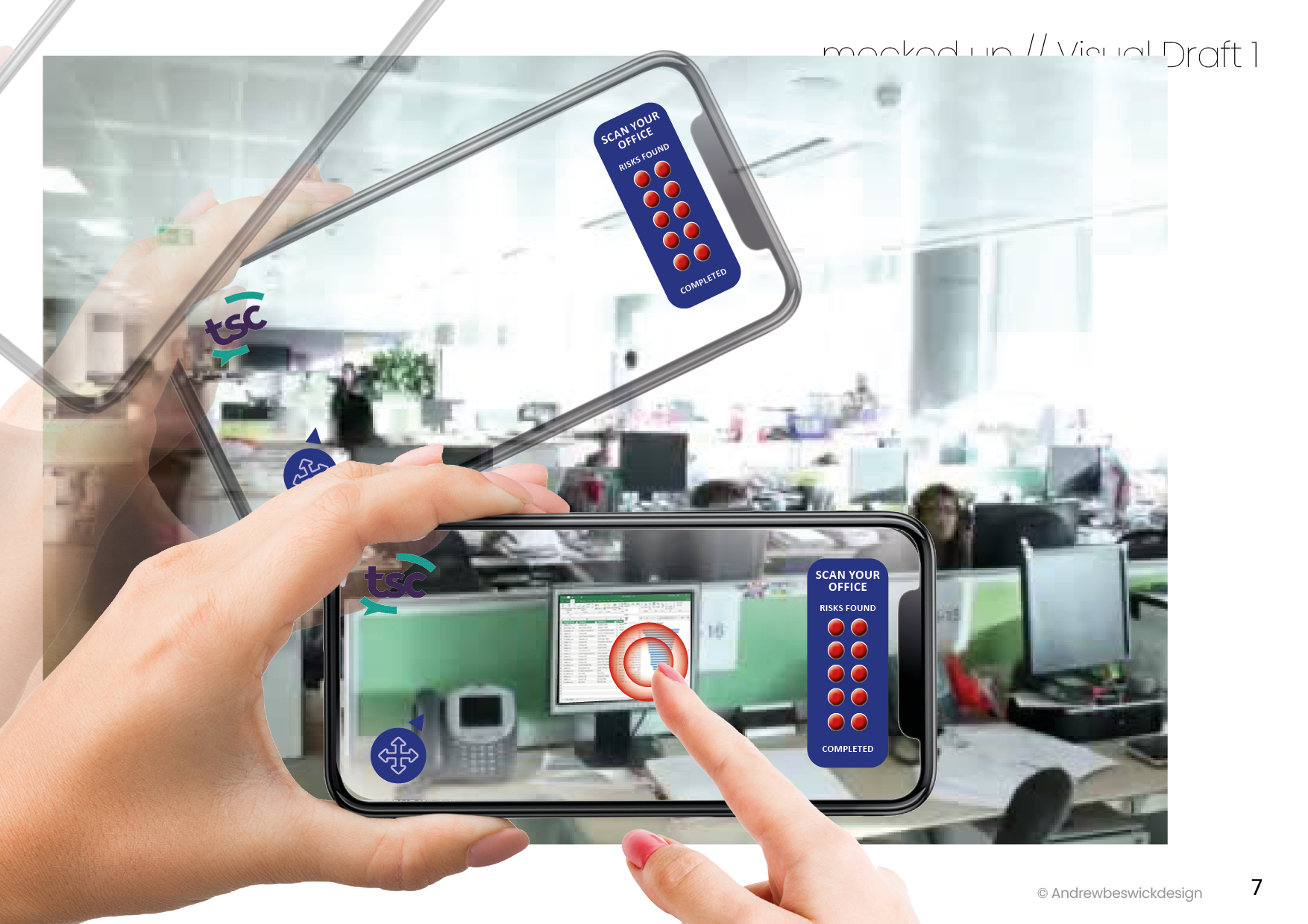
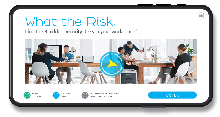
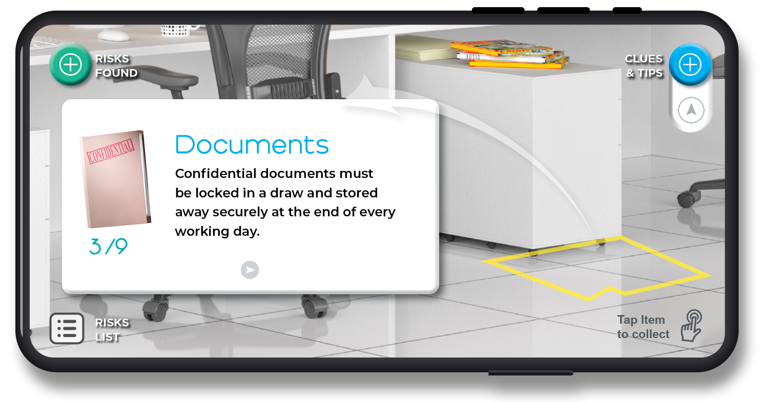
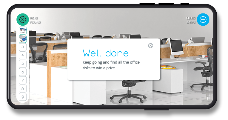
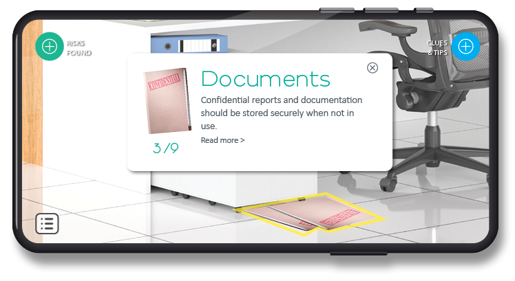
A clickable prototype video demonstrates demo levels, including introduction, user settings and tips for navigating an office environment to identify cyber risk items. It features a dashboard enriched with interactive elements and a touch of humour. For instance, a company scoreboard adds friendly competition by leveraging gamification and learning.
Development, design thinking and process
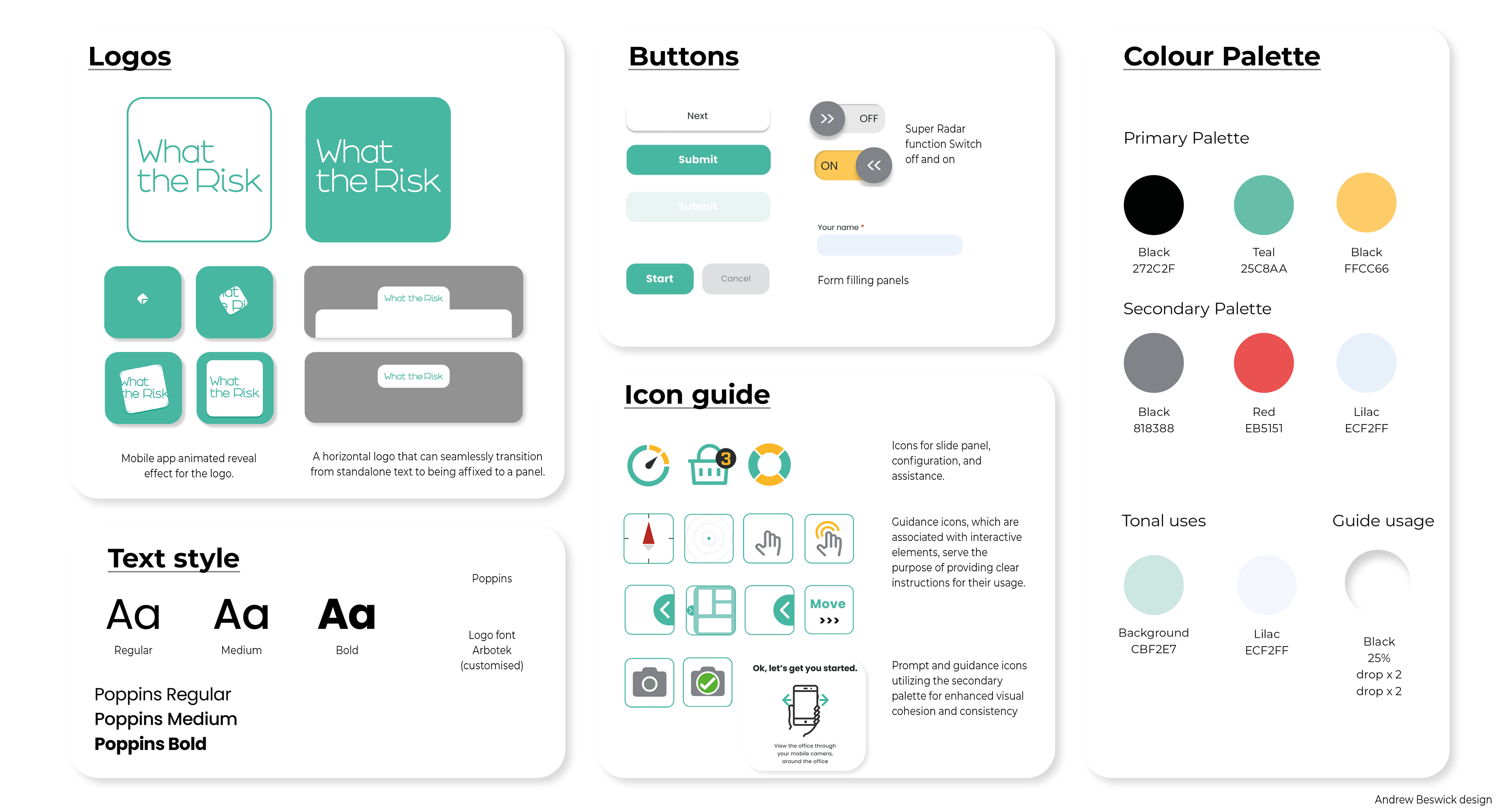
I chose a strong colour palette relating to the company brand and carried that through to elements and icons.
Visual journey screens
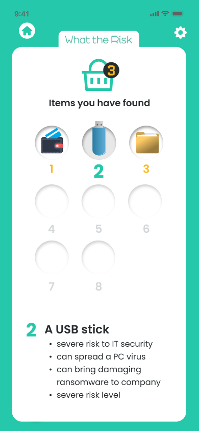
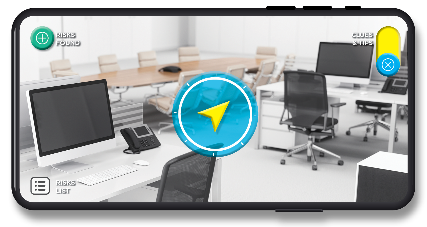
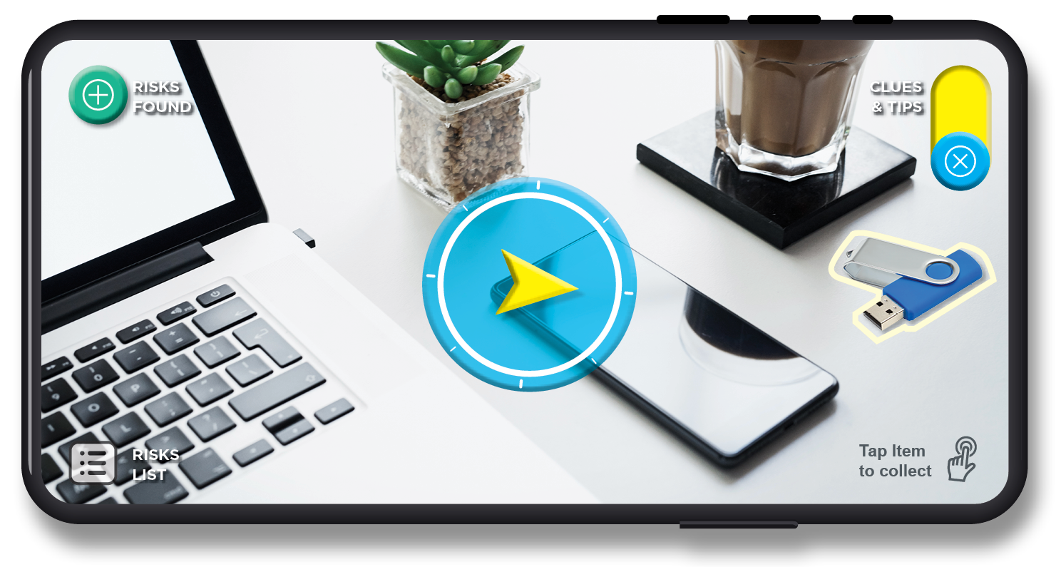
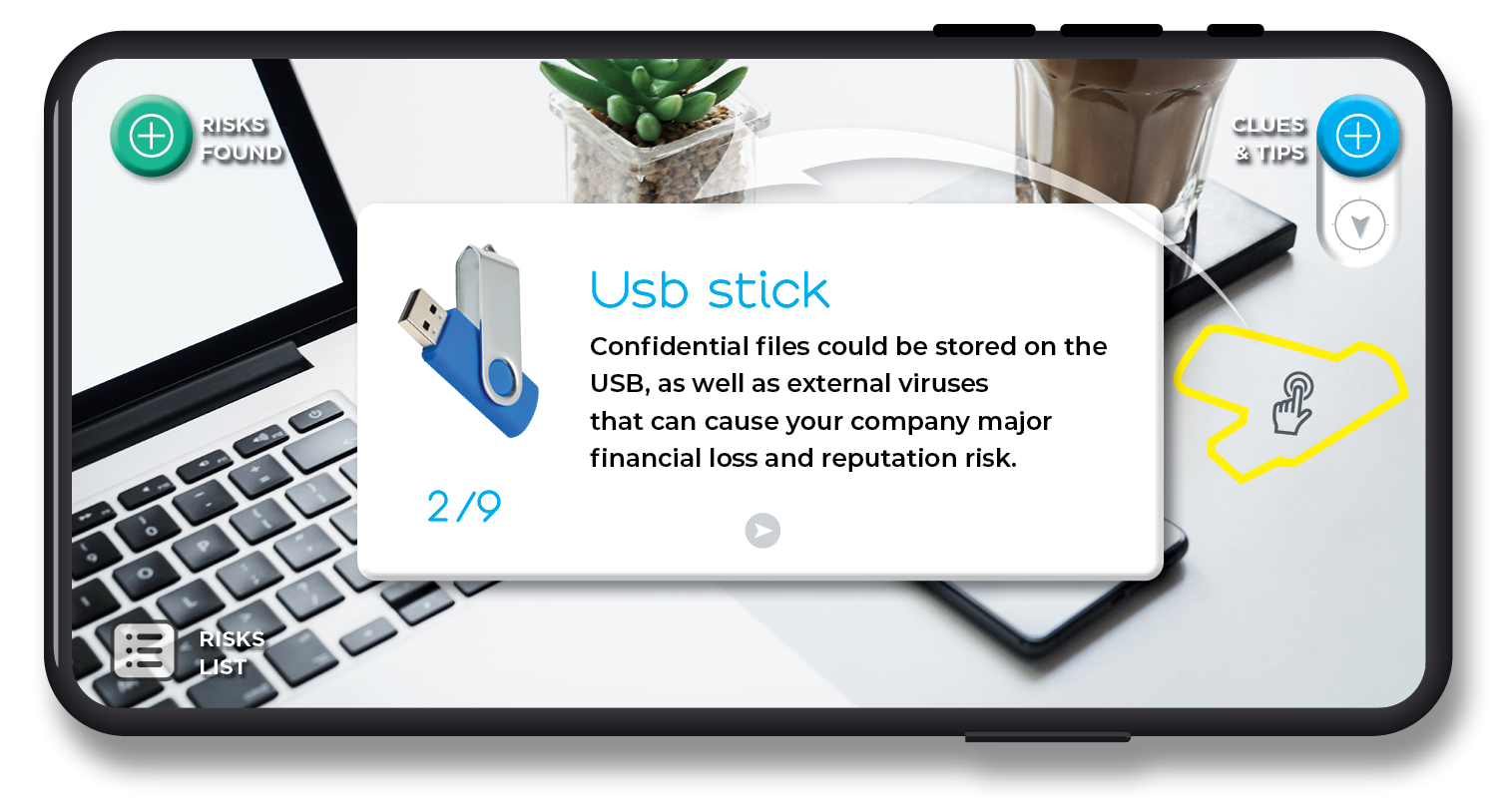
The user experience journey encompasses various stages, from providing information and guidance on the initial landing screen, offering pop-up help throughout the search process, and facilitating progress tracking through the dashboard. Additionally, users can engage in friendly competition with colleagues to foster learning and motivation.


Cybersecurity training inspiration
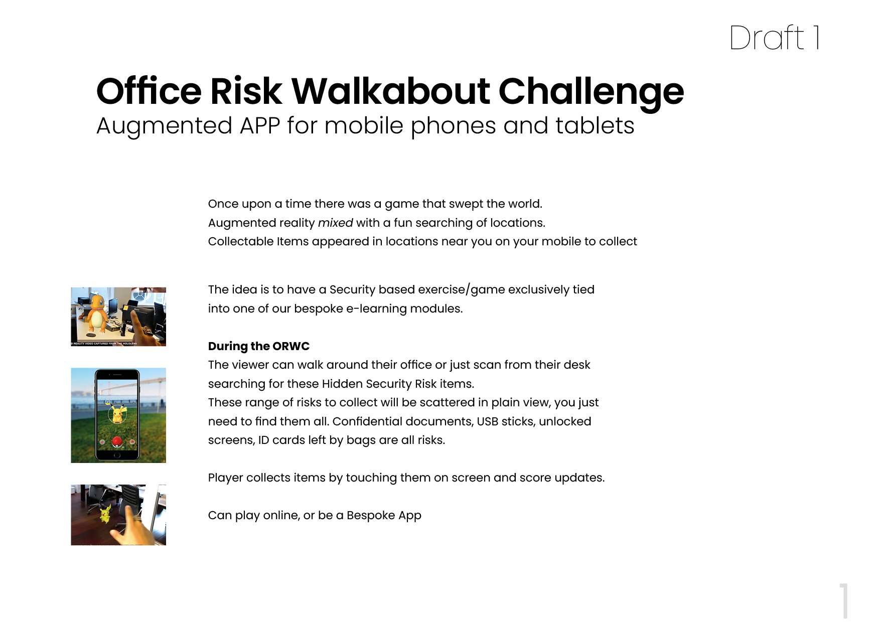
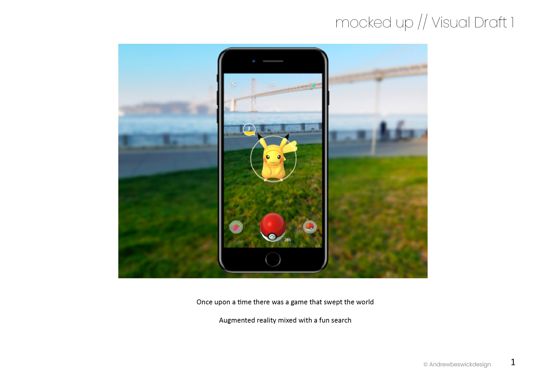
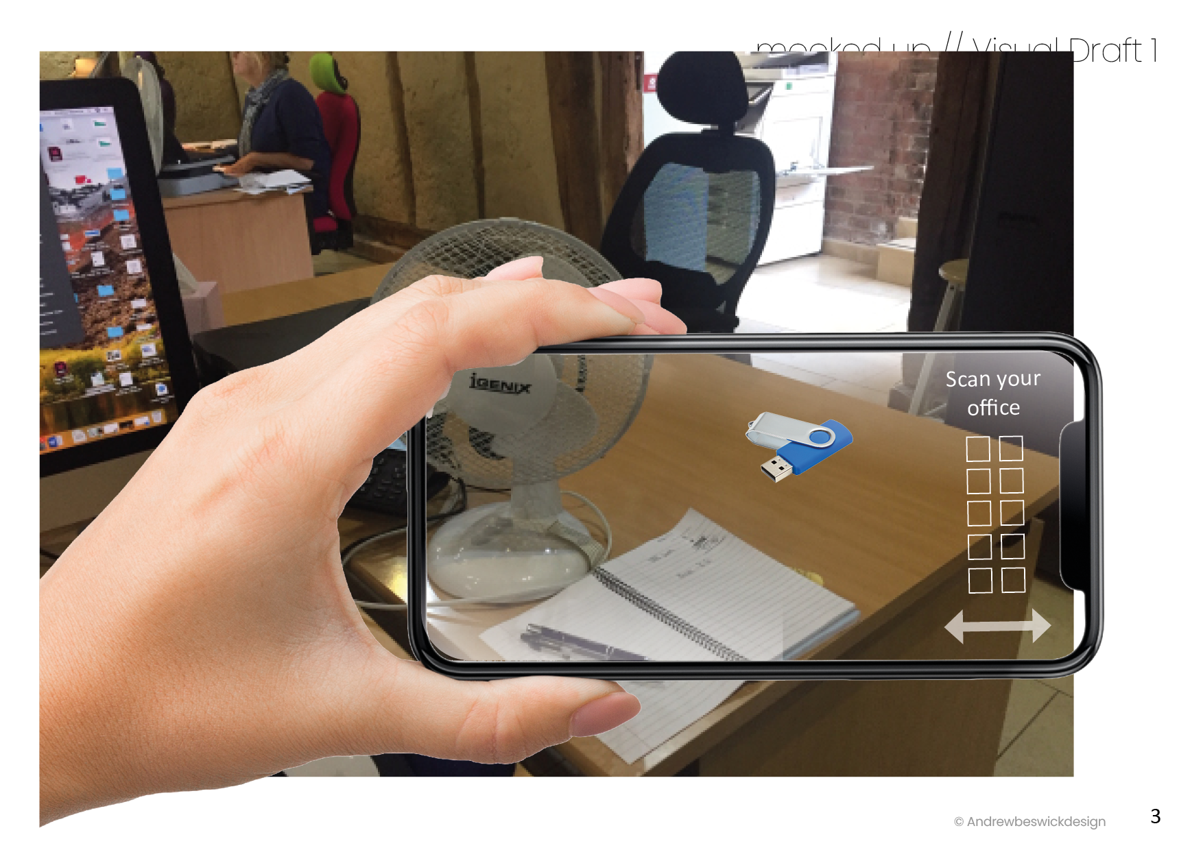
Inspired by the AR tech used in Pokémon Go to ideate a Cybersecurity workplace training app encouraging employees to engage actively and search for virtual items with their phones, simulating hands-on training for real-world challenges. This could be adapted and reused for other training scenarios.

Development, ideas and thoughts
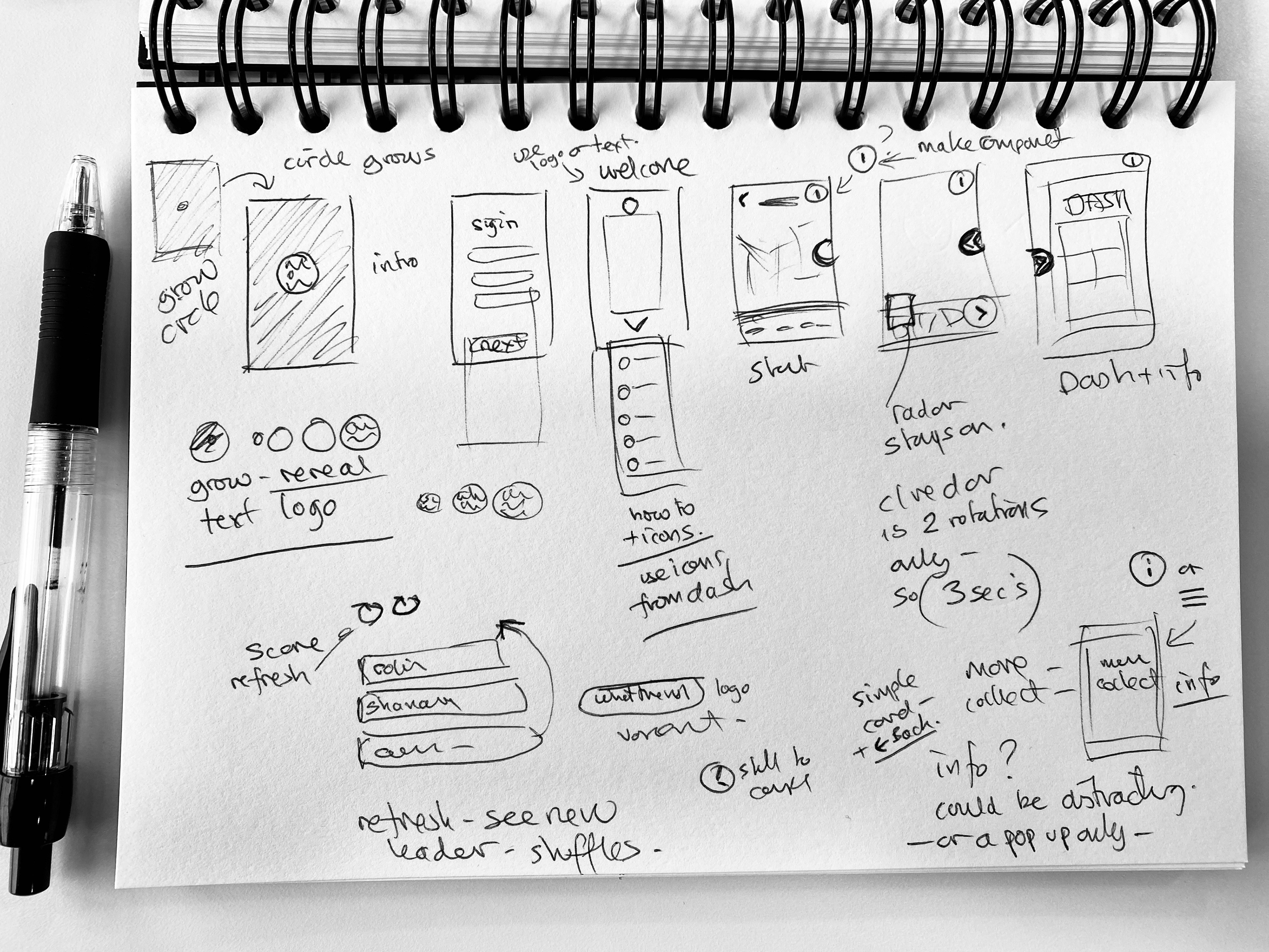
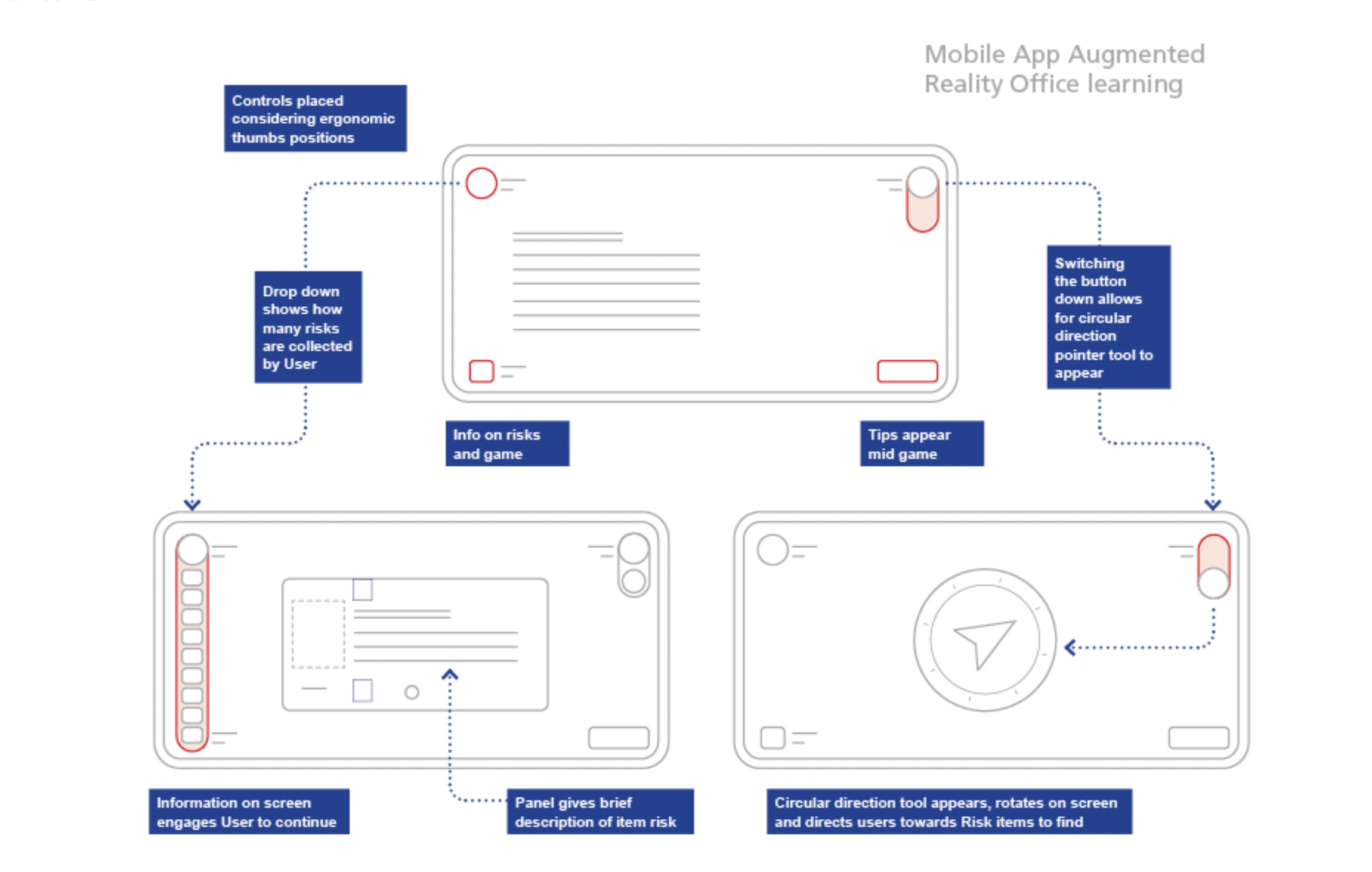
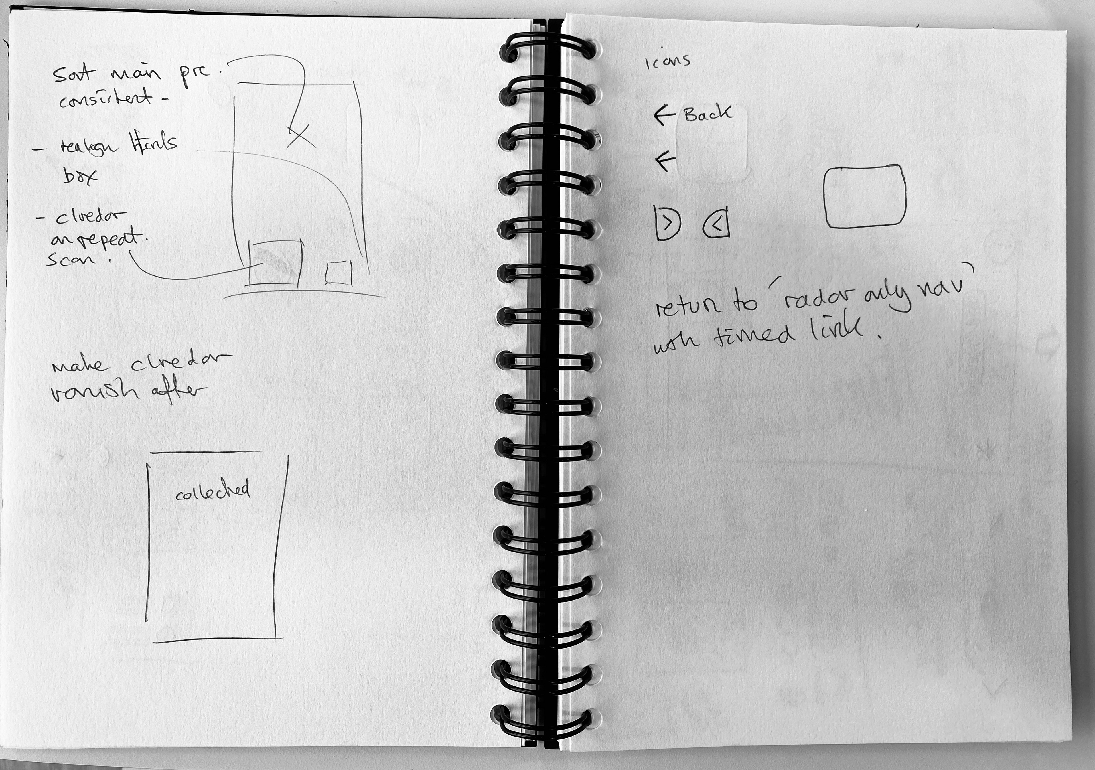
The development process involved creating initial sketches to explore optimal phone angles for users' comfort, easy access, and ergonomic hand positions.
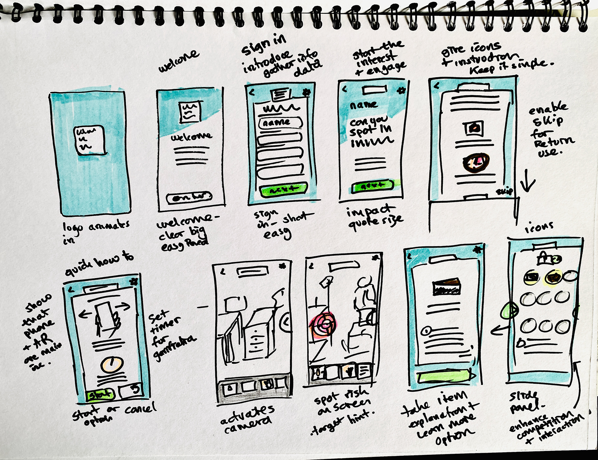
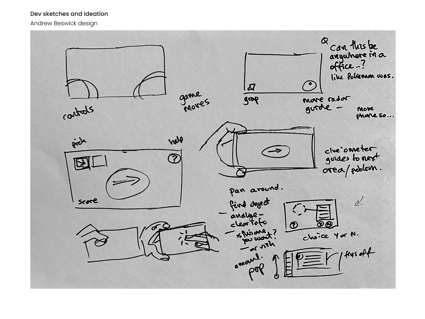
Initial sketches considered physical areas of screen, and controls.

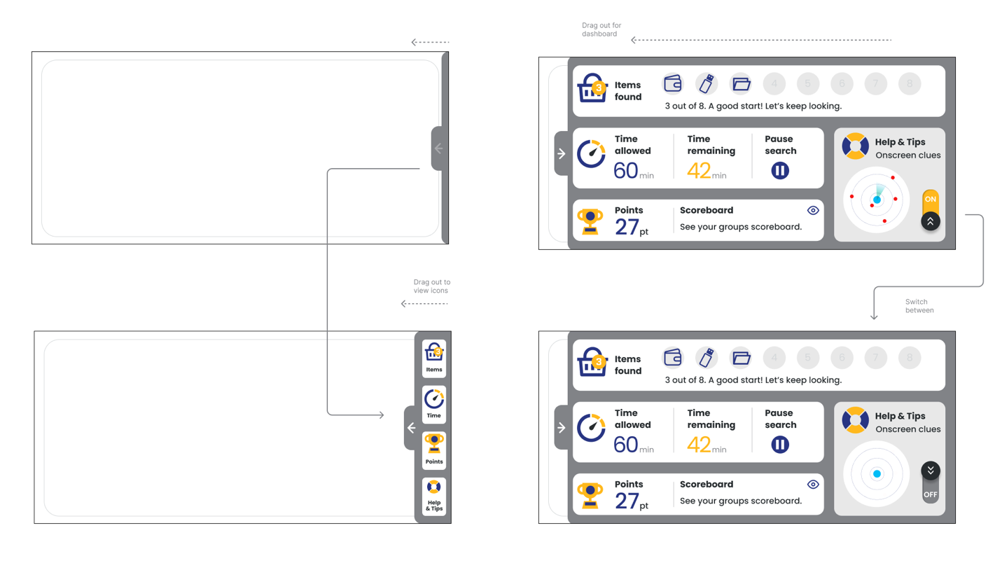
I then sketched ideas for prompts, and a control dashboard.

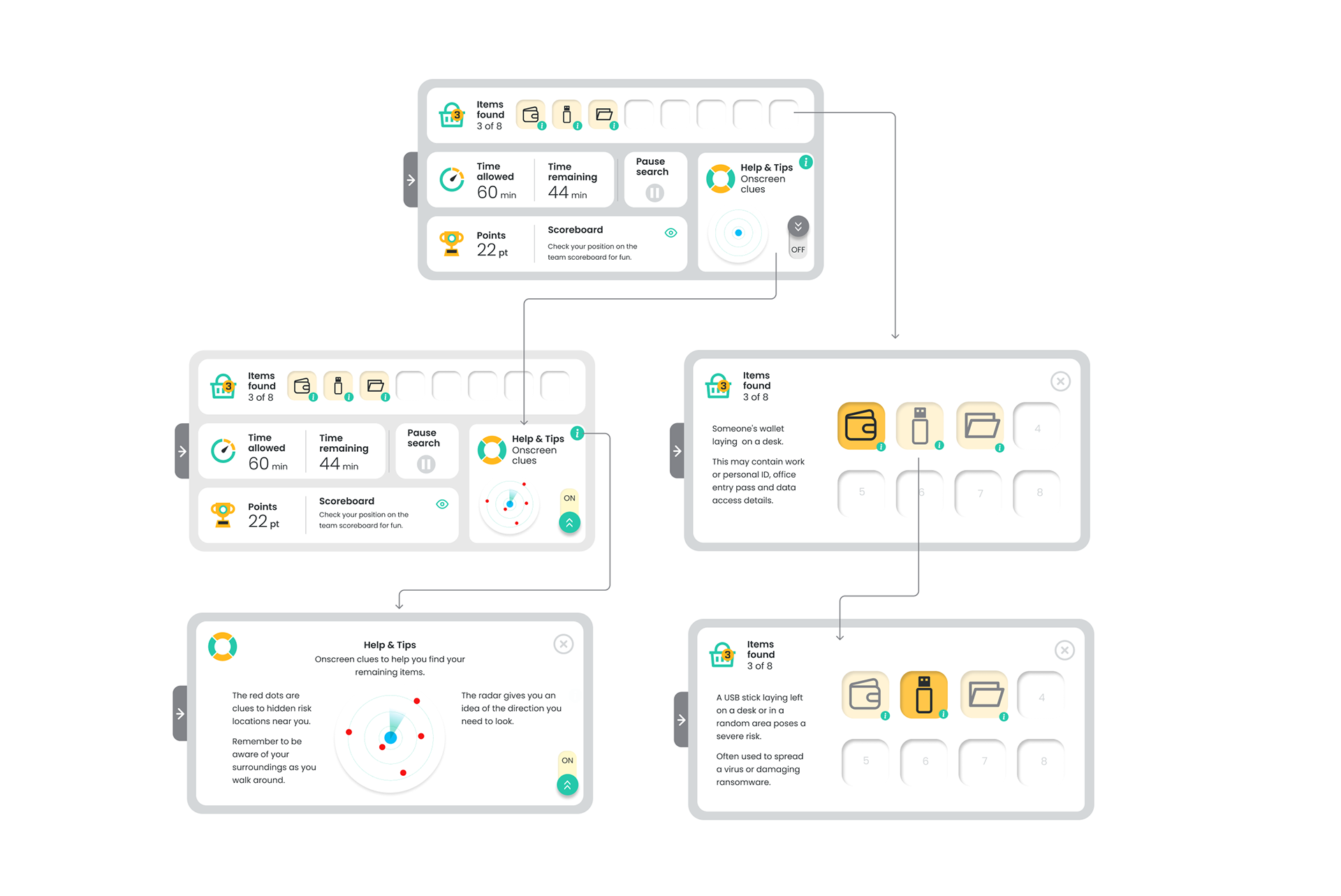
Dashboard idea developed to have a time taken record, clues, radar guide graphic, and collected items with information to learn from in each item found.
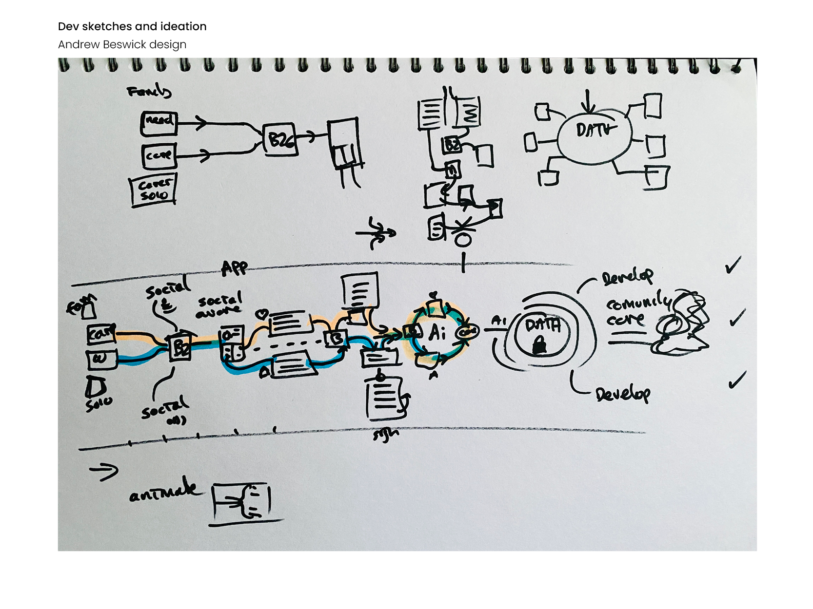
I sketched a journey idea for information from each user, data that would compile and the training records that could be useful data.
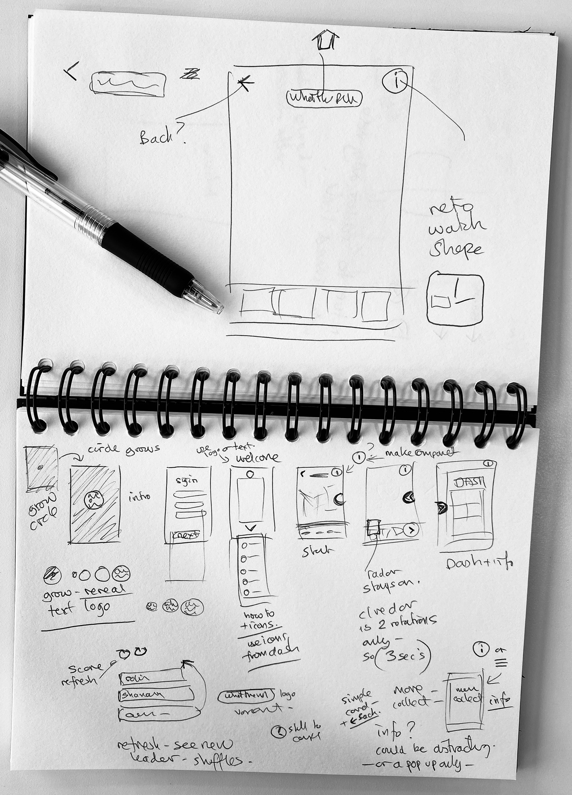
Initial prototype mock-up and first drafts
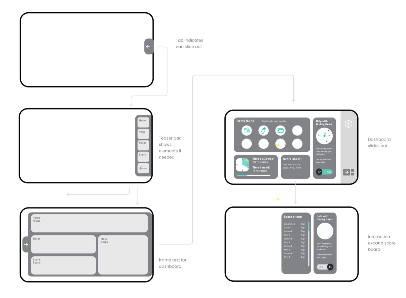
I've developed a new sliding panel dashboard design option showcasing fresh icons and brand colours.

Revised and refined dashboard designs
I've developed a new sliding panel dashboard design option featuring new icons and new brand colours.
Usability and interaction thoughts
After testing the app over morning coffee in a new environment, I sketched out fresh user flow ideas to simplify usability and interaction.
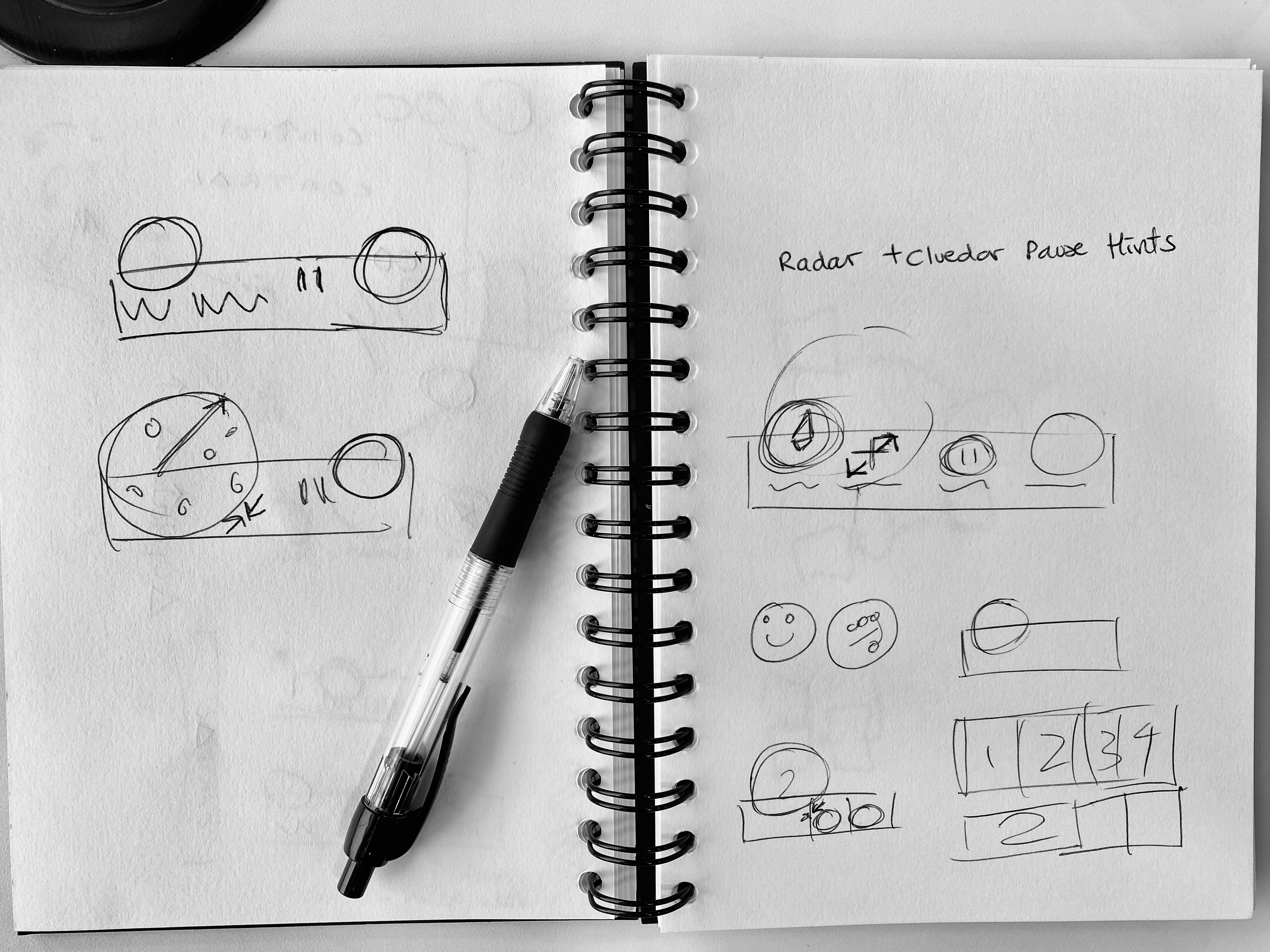
Large radar circular musings for Nav bar

Thinking about a simple sign in page
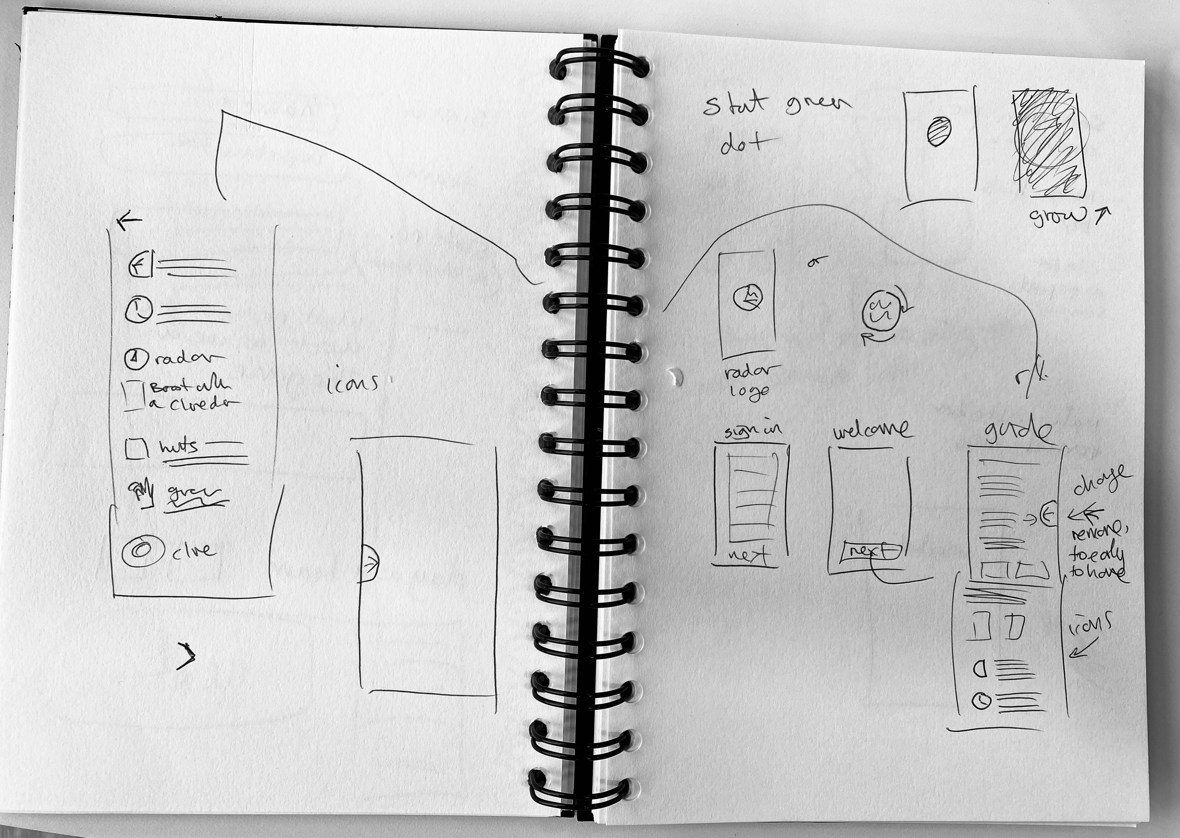
Instruction guide using existing and new icons
Scribble re: ergonomic touch areas
Standard screen